Hey, here is our list of possible fonts and the connotations we get from each with audience feedback and our own view on the fonts and the one we will pick for our production!
Product Name: The New Man
Product Name: The New Man
Production Company: J+G Productions
Fonts: We will ask people about the name of the film in
different fonts and what connotations this implies.
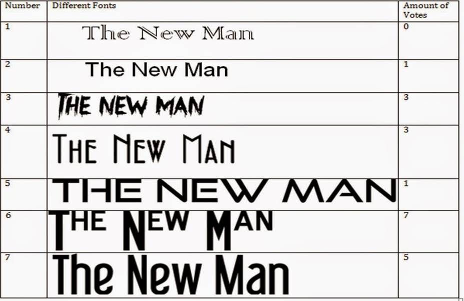
From this survey I can see that most people prefer the 6th
and 7th font , these two have been narrowed down by me and Georgia and
will now trial both on our film and see which looks better.
Connotation’s: “Currently the connotations I get from the
logos include a horror theme with the 6th and 7th logo is
simple yet effective” Quote Hannah Ginns 2014
“I really like the last one as it is simple as many other
films with abductions have a very simple Arial font” Phoebe Piper 2014
“The 6th one is really nice as it has an
effective capital letter at the beginning which makes it look individual”
Georgia Murray 2014
“The 6th one has very effective capital letters which
signifies a scary atmosphere, and stands out which makes it easier to read. The
capital letters imply that there is something withheld in the film” Hannah
Dunstan 2014
From these reviews and comments we have decided to use the 6th one and we like how the capital letters make it look different and fits in with our research into similar products as films like 'Taken' has a simple Arial font which fits in with our films synopsis and genre.
No comments:
Post a Comment